Vector&Velvet
Type & lettering
September 26, 2026
Why kerning still matters (a short rant)
Fonts arrive pre-spaced, so why do we still nudge letters by hand? Because big type exposes everything.
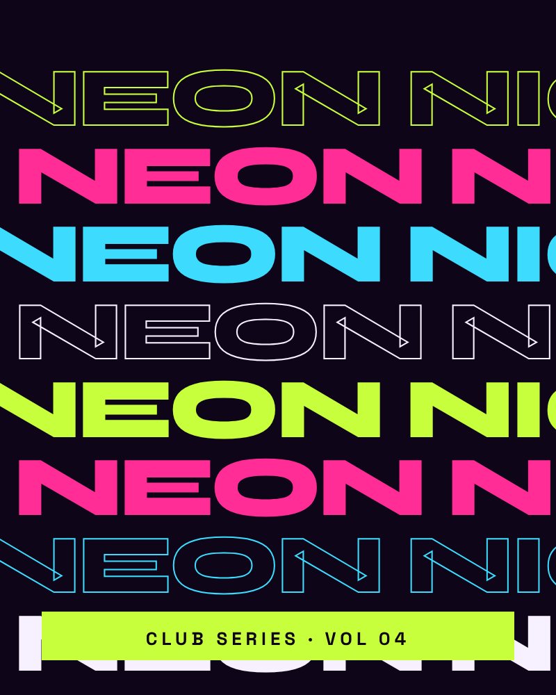
Modern fonts are beautifully spaced — at reading sizes. Blow a headline up to billboard size and every awkward gap is suddenly a canyon.
The usual suspects
Pairs like AV, To, Wa and LT almost always need help at display sizes. So do numbers, which are spaced for tables, not headlines.
Our rule of thumb
Kern anything larger than 48 pixels, and anything that will be printed bigger than your hand. Turn the word upside down to judge the spacing without reading it.
Nobody notices good kerning. Everybody feels bad kerning.
Studio motto
Keep reading
More field notes.
Read ↗
Process
13.10.2026
How we name a brand in two weeks
Three hundred words on a wall, one workshop and a lot of saying them out loud. Our naming sprint, step
Read ↗
Branding
05.10.2026
Colour systems that survive real life
A palette that looks perfect in a deck can fall apart on a phone screen at noon. How we build
Got a brief?
Let’s make something impossible to ignore.
Tell us about your brand, your deadline and the thing that keeps you up at night. We reply within one working day.